What’s new with the Chargemap mobile app?
27 May 2020 - 2 minutes to read
During the lockdown, our developers and designers at Chargemap have been working on harmonising the graphics on the mobile app and improving the ergonomics. We proudly present an illustrated overview of the most recent enhancements introduced to optimise your browsing comfort.
A clearer, more accessible key
An easy-to-find, simple key is the starting point for effortlessly browsing through a map structure like Chargemap’s. That’s why we have explored ways to make it more visible and accessible for everyone.
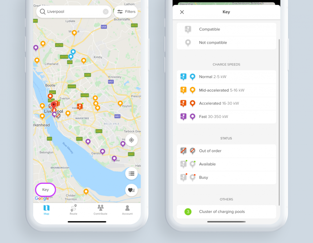
On the map, the button to consult the key used to be symbolised by “?”, but is now called “Key” (total transparency guaranteed ?) and has been placed at the lower left of the screen so that it stands out.
The key is now divided into specific, self-explanatory segments:
- Chargemap Pass: to differentiate between charging stations that are compatible with your Chargemap badge or not.
- Charging power: to visualise the power rating of each charging station.
- Status: to check at a glance whether a charging station is marked available, unavailable or out-of-service.
- Others: a new category which currently includes the icon representing a cluster of charging pools.
A simplified filtering system
In terms of filters, changes have been made to facilitate finding the charging stations that correspond to your requirements.
- Just like with the key, the button to access the filters is now called…wait for it… “Filters”. The team has also opted for a more intuitive icon.
- The button for filtering charging stations compatible with the Chargemap Pass, accessible from the map next to the filter button has been removed from the map. Not everyone found it useful and the map now sports a much cleaner look. For fans of this feature, the filter is still accessible and posted in prime position on the filters screen ?.
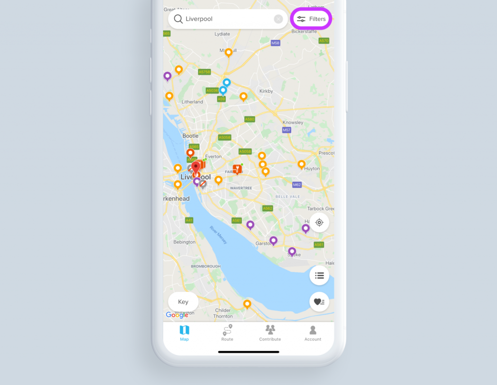
- Removal of the main switch: you no longer need to activate/deactivate the filters to start using them. You just need to tap the “Filters” button for your settings to be instantaneously applied.
- The validation button has been removed. Your settings are saved as soon as you change them.
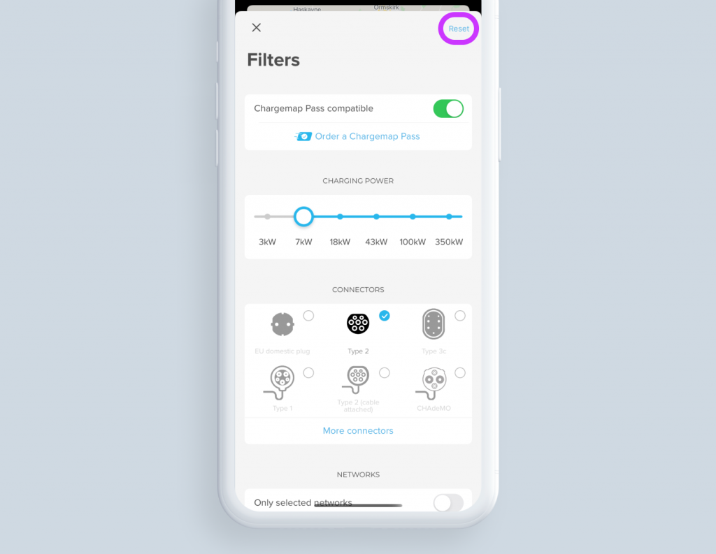
- To see all the charging stations again, the “Reset” function has been positioned right at the top for greater visibility.
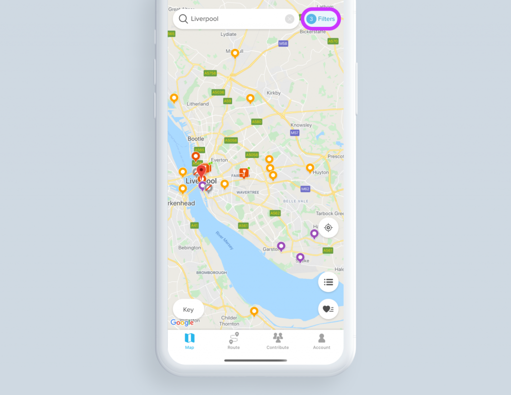
- When you are on the map, the number of filters activated can be consulted at a glance. This means you can now see which filters remain activated during your search.
Easier-to-read lists
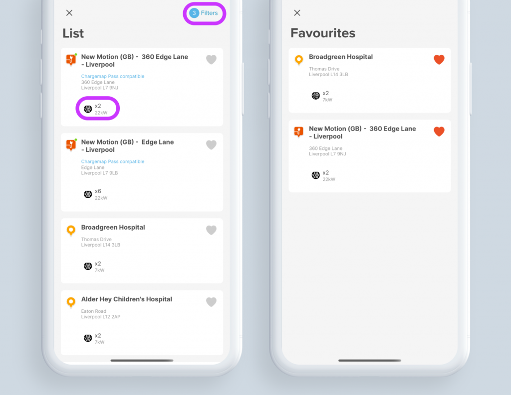
The display mode per list of nearby charging stations and the list of favourites have also been upgraded. Here, the aim is to provide you with all the information you may need in a neat package.
- The address of the charging pool and the distance from where you are currently located have been added.
- The icon representing the connectors available now carries extra information i.e. the number of connectors for each type and their respective power ratings.
- You can access the filters directly from the header of the list mode giving the nearest charging stations.
That’s all for now on this first set of changes to the Chargemap app interface. Others will follow shortly. Please don’t hesitate to contact us or leave a comment if you have any remarks or suggestions for improvements.
In the meantime, don’t forget to update your Chargemap app and stay connected so that you don’t miss out on any new features on the Chargemap app.
If you haven’t already done so,
join the largest community of EV drivers!

